{{ f.n }}
{{ f.title }}
{{ f.body }}
{{ f.quote }}
Capital One is the 9th largest U.S. bank, with 69 million potential Gen Z customers, many of whom will stick with their first bank for 17 years. But…

By designing features that bring context, personalization, and confidence to their financial journey.
{{ f.body }}
{{ f.quote }}
{{ m.why }}
{{ i.body }}
{{ s.body }}
Our goal with the mid-fidelity prototype was to experiment with interaction patterns and discover innovative ways to engage users with our ideas.
What started as a straightforward quiz turned into an opportunity to explore how different interaction styles can shape engagement and clarity.
Confusing because users don't know where they can click
These methods of engagement matched the users' mental models and hence were straightforward to use
As we tested early concepts, it became clear that users struggled to find the right level of detail in their transaction insights. We responded by trying out new ways of presenting key information and simplifying the paths to access it.
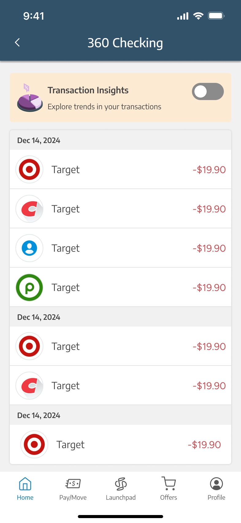
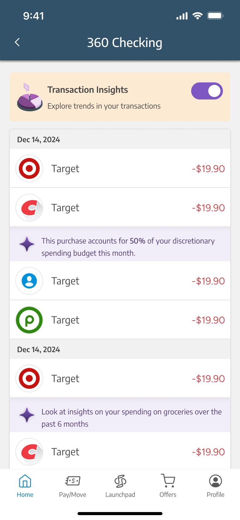
Surface-level insights didn’t offer much value, especially for users who wanted to track their habits over time.
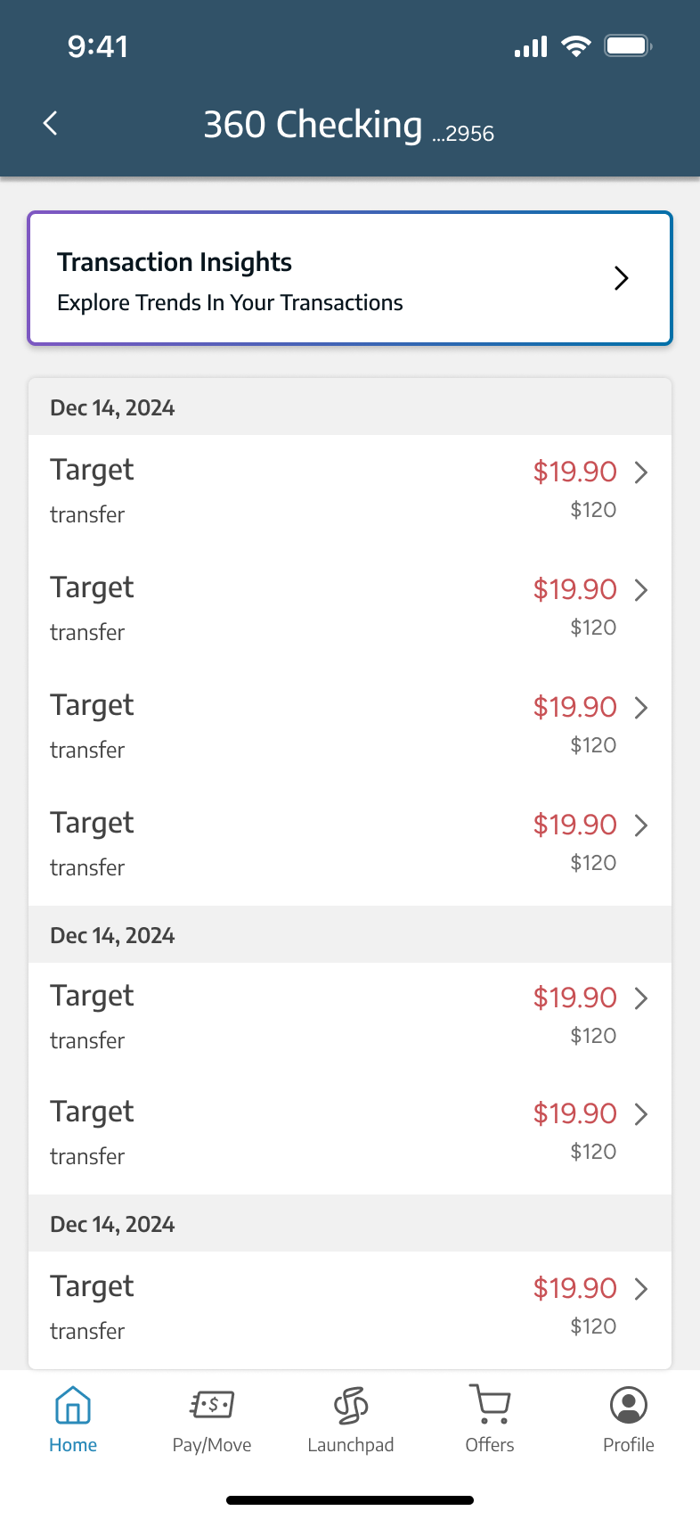
Users valued having a clear summary upfront, with the option to dive deeper into specific insights as needed.
How might we surface the types of transactions users care about most, in a way that feels clear and intuitive?
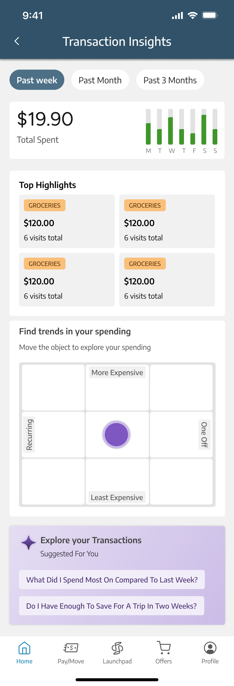
All four modalities were tested. “Find trends in your spending” was the most successful, so we built it into the Transaction Insights hub.
We learned that while they wanted precise details about their transactions, they also looked for guidance when things weren’t going well and reassurance when they were on the right track.
We found that Gen Z expected AI to go beyond data analysis. They wanted it to explain new concepts, connect the dots, and suggest tangible actions they could take next.
{{ b.body }}
{{ t.body }}
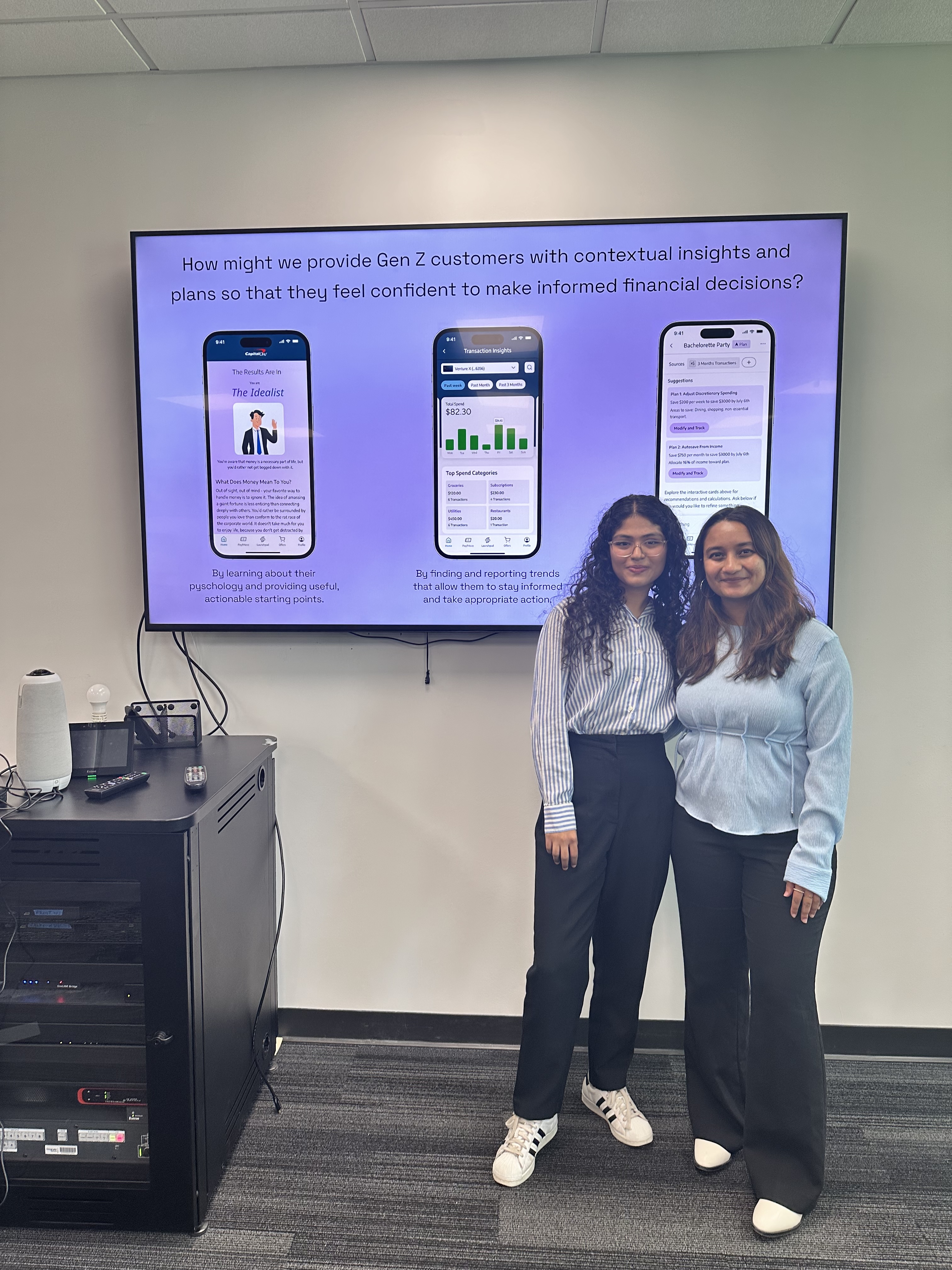
This project tested our creativity and patience but taught us so much along the way. We came out of it with a stronger appreciation for how Gen Z navigates money and financial confidence.
If you would like to see the nitty-gritty of research & design explorations that went into crafting this experience, please click here! I normally walk people through this in an interview environment or in a coffee chat.